Another Introduction
Welcome!
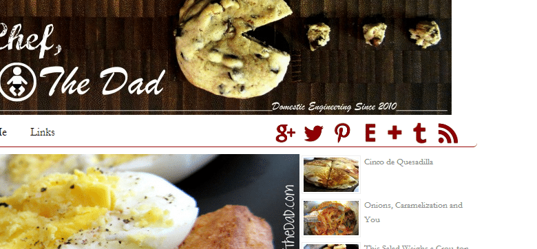
By now I would hope that you’ve noticed a few new things around here. Let me start by acknowledging the elephant in the room:
This is my new home! Thanks to a birthday gift from my mom (thanks mom!) I am now the proud owner of TheManTheChefTheDad.com. This not only means it’s going to be easier to share my address with people, but it also means I’m invested, so no more slacking off!
So far, despite having to spend a good 2 weeks of using my free time (which is usually time that I have to take away from a good night’s sleep) to fix this place up the way I wanted it, I’m extremely happy with the change. The differences between a free blog and a paid blog are apparent. I had to find a new theme that I liked, which proved to be the most difficult of tasks, but once that was done it felt all downhill. A really, really big hill, but it was fun. Thanks to Jenn Bauguss for talking up WordPress, the joys of blog ownership and getting me to try new waters.
As far as my old subscribers go, if you’re worried about having to subscribe again, then don’t worry. The good folks over at WordPress.com migrated everyone over with the greatest of ease.
Of course… You probably already figured that out since this was in your mailbox.
Alright, enough about what I had to deal with, let’s talk about what’s new! Starting from the top:
You’ll notice my social media icons are lined up there. One of the two icons that may seem strange to you is the big “E” which is not for Etsy, but for EyeEm, my photo sharing network of choice. I loved my network of friends on Instagram, but with all that drama last year along with just having too many network streams to go through, I decided to quit the Instagraming. EyeEm is crazy sleek and downright beautiful to look at as an app/network. And since 98% of everyone I know is on Instagram, I don’t feel obligated to go through another stream at the end of the day (although, sometimes I’d like to because EyeEm is pretty sweet).
The other icon is the more familiar cross belonging to Bloglovin’. Now that I’m not going crazy trying to get this up and running, I look forward to putting Bloglovin’ to use and catching up on everything I missed from being so deep in plugins and CSS. Or shall I say guessing at CSS.
The second thing that probably sticks out like a sore thumb is the slideshow. Sore thumb or not, I really love how it displays the last 4 posts, up front and center. I feel like it’s going to force me to take better pictures. Haha.
Going down the sidebar:
You’ll notice my snazzy welcome message to my visitors which also links to my About page.
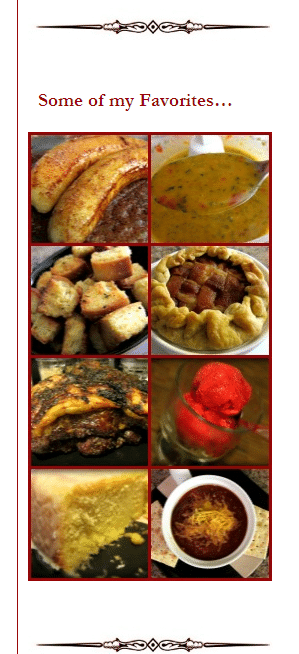
Next, an updated Google Custom Search bar. Then, following where you can subscribe via email and view my recent scrolling tweets (so freaking cool), you’ll find some new favorites of mine. I tried to go with recipes that you’ll appreciate during the spring/summer months since I noticed my last collection of favorites seemed like it was more for the fall. Finally at the bottom is the Random Post button, which is probably my most favorite addition! Even though it might point you to a post that was published back when I started and contains less than stellar pictures. I mean, I know I’m no pro now, but compared to some of the pics I have on here… Let’s just say I have to do some more updating to older posts.
I have to say thanks to Ashton over at Something Swanky for not only giving me some tips, but for posting a tutorial on how to create a gallery for your sidebar and a tutorial containing free social media icons and how to use them. Both of which were crazy helpful and I urge you to check out her site if you haven’t because there are tons of other great ideas she has going on over there.
I also wanted to say thanks to image-maps.com for creating one hell of a mapping tool which made the sidebar possible, as well as the link in my little welcome message. Great, free tool, so check them out if you need something like that.
And another thanks to Chelsea Tera for her tips on blog presentation and offering to help with some pesky codes.
Ok, as for the rest of the blog, the posts themselves are getting love too:
I recently started adding music back into my life so I thought I should add it to my blog as well. I was posting YouTube videos of songs I liked and that reminded me of what I was posting about. But thanks to my new home, the videos are being replaced by a nice little music player that I’m sticking on the top of every post. You can’t control volume or rewinding, just play and pause. I’ll give a little line or two at the bottom of the post about the song and where to get it. My hopes are that you press play and listen to the song as you check out the post. Of course, you don’t have to listen, but it’s there if you do.
Continuing on, now not only can you hover over a picture and utilize the crazy convenient Pin it button that appears, but you can also leave a comment via Google+ if that’s your thing. I’m a huge fan of Google+ and know something like this is appreciated. Really brings a whole new social aspect to the posts. The only thing I don’t like is how I have no way of knowing a comment was made there unless I either check it, or I’m mentioned in there when it is publicly shared. I have learned that if you post a the link on Google+, it will show up automatically in the Google+ comments section at the bottom of the post, so that’s pretty awesome. It’s a fairly new plugin so I’m not entirely sure if there are a lot of bugs with it or if there are any other negatives. But so far, it’s a welcomed addition, as is the ever popular Commentluv check box when you leave a comment.
And that’s about it with the changes. I love the way it came out but of course I’ll be tweaking things here and there when they pop up.
Thanks for stopping by and I hope you like my new home!
Please, check stuff out and let me know what you think!
About the song: Almost Over by Limp Bizkit – It’s a song that talks about growing up,
changing your life and becoming something better. It’s something that fits me not only in life,
but also with this blog thing I have going on. So I thought it was fitting. It is off Results May Vary.


I looooooove that Pac Man graphic. Too cute! And congrats on your transition – blog changes are hard at the time but worth it in the end!
Thank you very much! And yes, totally worth it.
CONGRATS!!! Believe me, I know the growing pains (still have nightmares about my transition from blogger to WP), but it will be so worth it. The site looks great. Well done!
Thank you!! I did blogger to wordpress and yeah, it was pretty freaking tedious. Totally happy with the change though. Like night and day.
Congratulations on your new home! Looking good!
Thank you! And Thank you!
I love your new header! SO creative!
Thanks!!
Looks awesome! As someone who is continually tweaking her own site (and who basically only knows what the good Google machine tells her about CSS) I can appreciate all of the hard work that goes into building a site. (Also, why is everything so hard all of the time??) Even with themes and plug-ins, it’s a phenomenal amount of effort and you did a great job!
Thank you!!! I appreciate it deeply! I’m so happy to hear I’m not the only one who would pass out from trying to figure out CSS if it wasn’t for Google.
Love the look! Congrats on the new site!
Thank you so much!! Thank you, again!
Now that you fixed your blog you need to fix mine. Cause I am dying. From allergies. It is bad. Really.
I was dying from allergies probably about 3 weeks ago. It was terrible since I never had them before. Freaking NC.
And come on, let’s fix it up! I don’t know what I could do that’s so special but I’ll try!
Sheesh. There’s a lot that went into this migration. Well done, man. It looks great. Now get to the content! I want some sourdough French toast with a side of Dark Helmet. “Only one man would dare give me the raspberry.”
Holy crap! That’s gonna happen!!
Thank you, sir!